Psychology and Mexican Eats
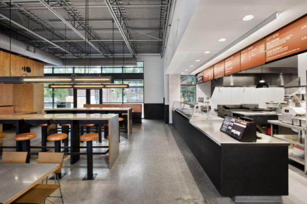
The interior of a Moe’s Southwest Grill location
It’s no surprise the word “chipotle” has come to mean far more than just a spicy condiment. In fact, almost immediately, the famous restaurant chain comes to mind at the mere mention of Mexican food.
Yet, there is also its competition: Moe’s Southwest Grill. These two restaurants have incredibly similar prices and menu options, yet one distinctly different feature separates them: their customers.
Many teens constantly walk into Chipotle and order their food, completely unaware of their surroundings. But if one were to just simply look around, he (and it would most likely be a he) would notice one big thing: the place is swarming with guys.
This is not a bad thing. In fact, Chipotle most likely influenced this phenomenon.
Take their restaurant design. Each store’s layout is different, yet they all have similar interior designs: hard, rigid edges, warm reds and cool grays, large-text menus, exposed ceiling rafters, and a very minimalistic approach to furniture.
In fact, one could say it looks a lot like a garage. In this sense, Chipotle is very much geared towards targeting male customers.
In marketing design, warm colors such as red and orange, as well as cool grays and black, are associated with appealing to men. Sports ads and men’s clothing ads are quite often displayed with colors such as red, orange, blue, and black.
It is also proven that reds give a sense of courage and grays provide a sense of calm and coolness.
The hard edges and garage-type design gives the restaurant a subconscious masculine feel, perhaps one of being in a metals or car workshop.
It is uncommon for males to truly care about the complexity and details of interior design; therefore, there are only the necessities: chairs, tables, and lights, each in plain colors. There aren’t even pictures hanging on the walls.
It is common, however, to find men, especially male teenagers, congregating in and around Chipotle. It has become a hotspot for a “guy’s night out”.
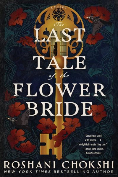
Moe’s, on the other hand, is a lot more expansive.
The customer attraction is widespread across both male and females. The interior design also contributes greatly to this fact.
The restaurant is awash in yellows, reds, greens. There are booths for families as well as chairs for smaller parties; the walls are vibrant, warm colors and the entire interior is curved and inviting.
In turn, there is an almost even mix of male and female customers; families with small children seem more common here as well.
The colors of the restaurant, much like Chipotle, are intentional. Greens and yellows represent peacefulness and happiness and are almost equally liked by both sexes.
The round edges express softness and comfort, especially to younger customers. The whole restaurant just exuberates a warm feeling compared to the harshness of Chipotle.
Both Mexican restaurants have the same food, service, and prices, yet both target different audiences. Perhaps each sees a group of customers ripe for the taking, one that the other fails to reach.
Whether it be Moe’s or Chipotle, one thing is for sure: food is food. And everyone loves food.